|
Friends I have not recently commented about coding but a few days ago I was very frustrated with an error that I could not easily work out. At the time it was not funny but now looking back on it, I think it is quite amusing, so I will share it here. It certainly makes quite a good blog title. Being dyslexic I used to use a variety of code letters and number when giving names and tags to things. I did this to try and reduce errors for example bd-mn-im1 cannot be confused with anything else, but it does not make my code that readable. 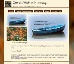 It was suggested to me that I could improve my code by using descriptive words rather than codes. Well this maybe the case but it does not make life easier for me. I give a recent example. 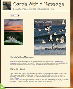 I was updating a website for responsive design using the viewport meta tag <meta name="viewport" content="width=device-width, initial-scale=1, maximum-scale=1"> and things were progressing quite well, until I got to an image section of the site. Because they looked like windows the elements had been called panes (window panes). Somehow I had run a spell correction over the bit I was changing (trying to do things in a hurry in the evening), which was not good. The pane had now become a pain!! The bit of code the helpful spell correcting software helped me with is given below #pane-main{left:330px;} @media only screen and (max-width: 768px){#pain-main{left:220px; } } And of course it does not work 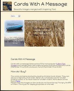 To compound the problem somehow the error had been replicated several times. After much frustration and using Google chrome developer tools I eventually identified the lines of css that were not working, but my dyslexia prevented me from seeing the error, only that it was not working. The tags looked correct so only by coding to a non verbose tag and proving that it worked and then retyping it back as a verbose tag did I spot the error and fix it. #pane-main{left:330px;} @media only screen and (max-width: 768px){#pane-main{left:220px; } } giving the desired result The time wasted on trying to find the error means that I have still to finish off updating the site, which I will try to do over the next few days.
0 Comments
Friends The observant follower will have noticed that I have not made a post for around a week and a half. Well I have not been on holiday putting my feet up, but rather the opposite, sorting out two self-catering holiday opportunities and their related websites. It was decided that there would be three websites, a general one and two specific ones. The brief for the websites was to have a style that was separate but also distinctive as being linked together. The colours were to be simple and expressing of their environment. Ie one related to the land, the second to the sea and the third some form of combination of the two. Initially we went down the line of exploring icons and having the two specific sites as subsets of the generic one, but this was ditched for the style we came up with. Probably a lot simpler, than the original idea. What we came up with was a colour palette that was significant reduced/restricted and the sites were based around having a base css style that was modified for the sites are required. 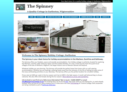 The Spinney Home Page The colour palette for www.thespinneycottage.co.uk was a couple of shades of blue, a red outline to highlight a link (this followed on from feedback saying they were not obvious) and a green to say that a booking date was available. This was originally a shade of blue but was changed on feedback. The shades of blue reflect the sea, as it is a seaside property. 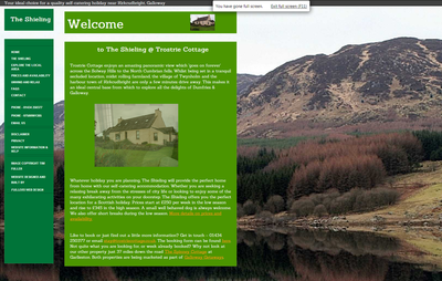 The Shieling @ Trostrie Cottage Home Page The colour palette for www.trostriecottage.co.uk was a couple of shades of green, but again following on from feedback the links were changed to a golden colour. To make them stand out a little more. Off white was also used rather than plain white so as not to stand out too much. The green colours of course reflect the environment around the property. 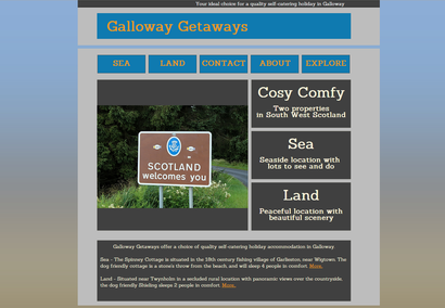 Galloway Getaways Home Page The final colour palette was for www.gallowaygetaways.co.uk . Here the neutral grey finally became the main colour set on a blue for the sky. The background image reflects the two ideas of the sea and the land. Having sorted out the style and the colour palette, the next thing is the images of the properties and their surroundings. A mixture of scrolling images and static ones are used on all three sites. As the saying a picture does say a thousand words is so true. Trostrie also has the added bonus of a changing background image, hopefully portraying the idea of some of the fantastic views available from the site.
The end result is hopefully three nice clear crisp sites that give an impression of a lovely holiday in South West Scotland. If you would like your website updated, or like one like this then do drop me a line [email protected] |
Tim Fuller
Dyslexic doodles on photography, food (growing, cooking & of course eating), faith and other fascinating things. This is a personal blog expressing my views. Archives
November 2015
Categories
All
|
| Fullers Folio |
|
 RSS Feed
